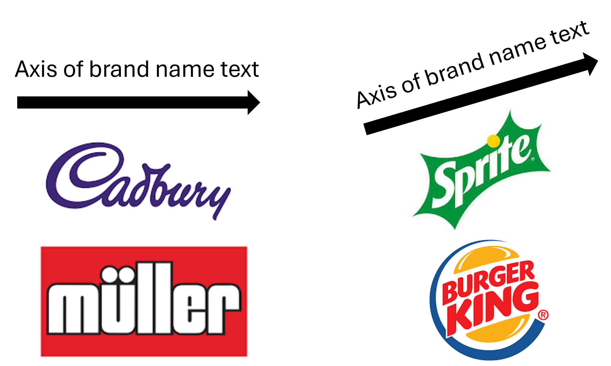
If a logo is tilted upwards, shoppers may instinctively judge the product as less healthy.
This finding comes from Tanvi Gupta (Indian Institute of Management Ahmedabad) and Henrik Hagtvedt (Boston College), whose multi-study paper in the Journal of Retailing explores how something as subtle as the angle of a logo can shift consumer perceptions of healthiness.
It’s a discovery that could have big implications for food and beverage brands, personal care products, and even retailers.
Why Logo Design Matters
Marketers have long known that colours, shapes, and textures influence how we judge packaging. A glossy finish often screams indulgence, while pale colours whisper “light” and “healthy.” But logos, the most enduring symbols of brand identity, haven’t been fully explored in this context.
Gupta and Hagtvedt’s research fills this gap. They looked at one simple, binary choice: should a logo sit horizontally, or should it tilt upwards?
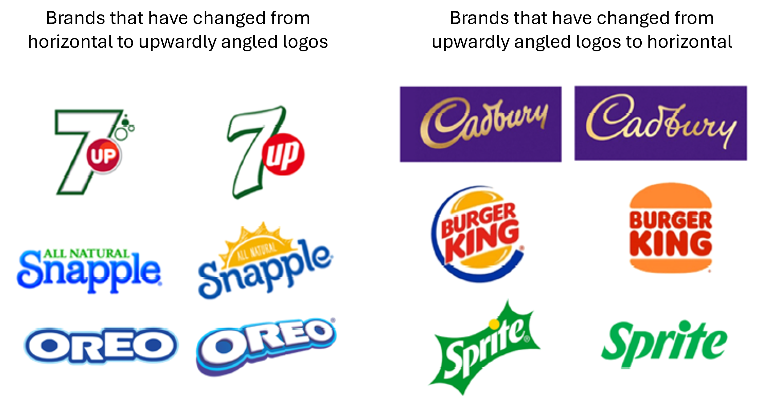
At first glance, the tilt might seem like a flourish of energy and optimism. After all, diagonals can feel dynamic, fun, and exciting. That’s one reason why brands from 7Up to Snapple have leaned into upward slants.
But here’s the catch: in the crowded supermarket, shoppers’ brains are constantly making snap judgements. Through years of exposure, we’ve learned to associate upward-tilted logos with sweets, fizzy drinks, and fast food, categories not exactly famed for health.
The Evidence: Nine Studies, One Conclusion
The researchers ran a series of nine studies (five main, four supplementary) to test their theory.
- Retail audits: They began by scanning supermarket aisles. Unhealthy products—think chocolate bars and sodas—were far more likely to sport upward-tilted logos than healthier options like water or nutrition bars.

- Implicit Association Tests (IATs): Participants were quicker and more accurate at pairing “tilted” with “unhealthy” than with “healthy,” suggesting a deep-seated mental link.
- Archival data: Analysing 220 real-world brands, they found those with upward-tilted logos were consistently rated less healthy.
- Experiments with fictitious brands: In controlled tests, a snack with an upward-tilted logo was judged less nutritious than the same snack with a horizontal logo, even when everything else was identical.
- Boundary conditions: Interestingly, the effect disappeared when the product was unambiguously healthy. For example, vitamin supplements weren’t judged less healthy if their logos were tilted, but ambiguous products like vitamin-infused sweets were.
Why Do Brands Tilt Their Logos at All?
If tilt cues “unhealthiness,” why use it?
Because it also conveys fun, excitement, and energy. Previous research has shown that diagonal lines create a sense of motion. For indulgent or hedonic products, ice cream, crisps, fizzy drinks, this can be a huge advantage. The tilt injects dynamism and playfulness, traits these categories thrive on.
But over time, that very success may have backfired. Consumers have now internalised the association: tilt equals treat, not health.
Implications for Marketers
The practical takeaway is clear:
- If you want to look healthy, stay straight. A horizontal logo is the safer bet for brands competing on wellness cues. That might explain why Cadbury, Burger King, and Domino’s have all recently shifted back to horizontal designs, perhaps in response to consumer health concerns.

- Use tilt strategically. Tilt still works brilliantly for hedonic products where health isn’t the selling point. Energy drinks, confectionery, or lifestyle brands can embrace it without fear.
- Beware of ambiguity. For products that straddle categories, like protein-packed chocolate or vitamin-fortified gummies, the tilt could send mixed messages and undermine your health credentials.
What This Means for Consumers
For shoppers, this is a gentle reminder that our brains often outsource judgement to design shortcuts. We may think we’re weighing nutritional labels, but sometimes it’s the logo angle nudging our decision.
Being aware of these subconscious cues can help us make more deliberate choices.
Beyond Food
Although the study focused heavily on food, the researchers also found the tilt-unhealthy effect extended to personal care items, such as skincare. That suggests a broader principle: when health matters, logo tilt matters.
Looking Ahead
Future research could probe even further. Does the degree of tilt make a difference? How do compound logos (mixing symbols and text at different angles) play out? And what happens when the same brand experiments with both tilted and horizontal versions across its product range?
One thing is certain: logo orientation isn’t just a stylistic choice. It’s a branding decision with psychological weight.
Final Word
So next time you’re in the supermarket, glance at the logos around you. Those upward-tilted ones may be beckoning you towards fun, indulgent, “treat yourself” products. The straight-lined ones, by contrast, may be quietly signalling restraint and health.
For brands, the challenge is in choosing the angle that best aligns with their promise. For consumers, the lesson is to look beyond the tilt, and not let a logo angle sway your sense of what’s healthy.


