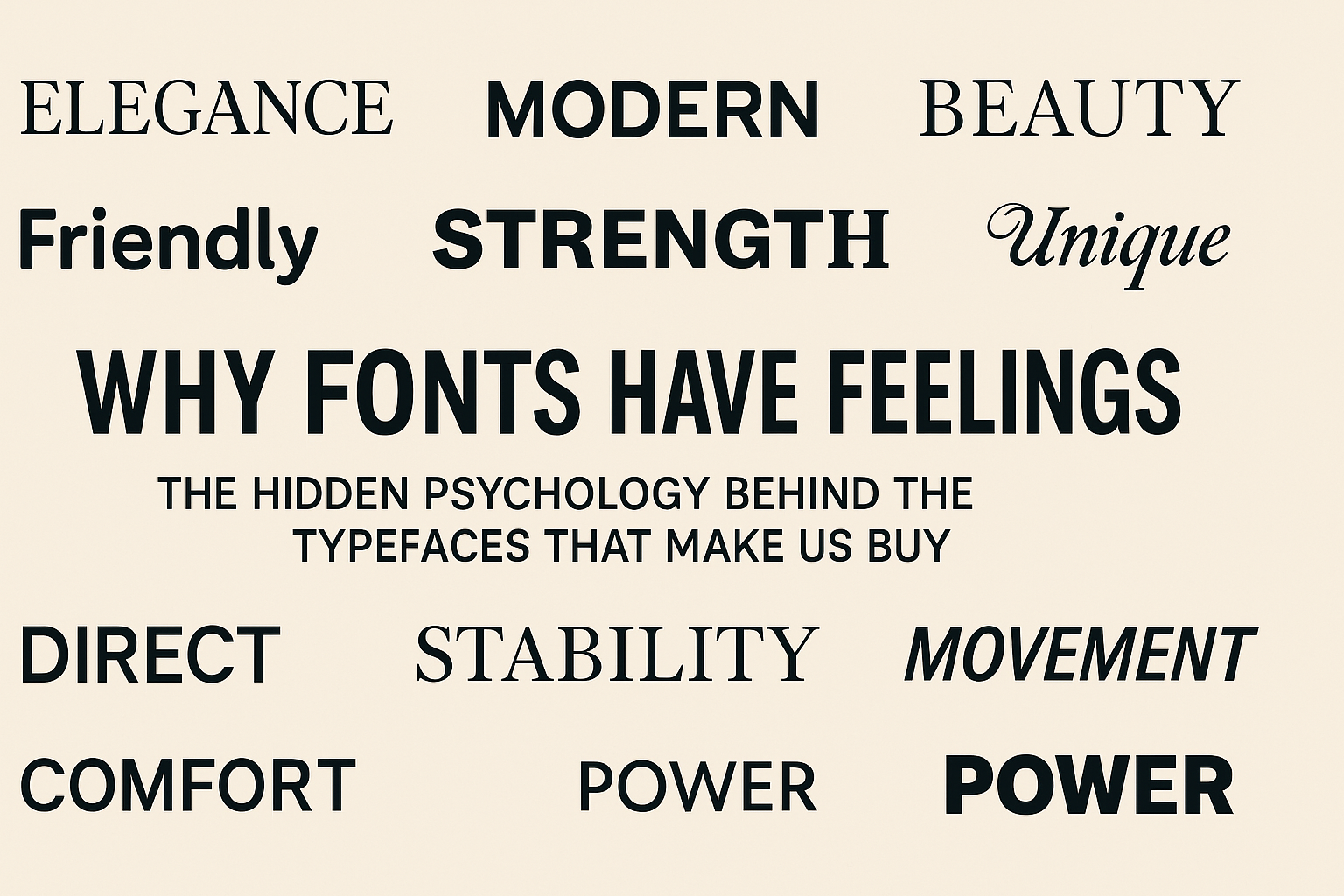
Fonts may seem like mere design details, the icing on a brand’s visual cake. But science suggests they shape our emotions, trust, and buying choices far more than most consumers realise. Every curve, weight, slant or serif sends subconscious signals about a brand’s personality and promise. And those signals can make us feel like a product is right for us… or not.
Research shows that our brains don’t simply read fonts, we judge them, feel them, and store emotional memories about them. All without noticing.
Whether we’re choosing a new shampoo, snacking on something sweet or scrolling through a brand’s website, typefaces can nudge us toward “add to basket”, or away from it. Here’s how it all works.
How We Judge Fonts in a Split Second
When we glance at a word, our brain immediately breaks the font down into its basic visual traits: thin or thick, rounded or angled, tall or short, tidy or decorative. These are universal design characteristics, the same cues we use to understand objects in the real world.
Because of that overlap, fonts are full of metaphor. A sleek, condensed font might remind us of something slim and modern, like the latest smartphone. A bold, blocky typeface brings to mind strength and masculinity, think power tools or protein supplements.
Our subconscious has stored away thousands of these associations across a lifetime:
- Where we’ve seen that font before
- Whether we trusted that brand
- What kind of products it’s been linked to
- The emotions it triggered at the time
Even specific font families carry long-term baggage: associations with governments, luxury fashion or even historical movements. These meanings can either strengthen or weaken depending on new contexts.
All of this activation, the memories, metaphors and moods, blends together into a feeling. And if that feeling matches the product or message we’re looking at, we experience fluency: the sense that something “just feels right.” Our brain rewards that fluency with positive emotion.
That’s why we often can’t explain why a particular option looks best. We simply sense the right choice.
The Big Font Personalities Brands Use to Persuade Us
So what do different typographic choices say about brands and products? Here’s a tour through the science-backed meanings consumers subconsciously attach to common font traits.
Serif vs Sans Serif: Tradition Meets Innovation
Serif fonts, those with decorative little flicks on the letters, are generally linked with elegance, authority and formal contexts. They can also feel scientific and rational.
Sans serif fonts, on the other hand, are viewed as more informal, modern and innovative, perfect for crisp digital experiences.
📍 Consumer takeaway: We trust serifs with serious information (think banking or academia)… but we expect sans serifs on tech brands and apps.
Weight: Beauty vs Boldness
- Light fonts: beauty, delicacy, femininity
- Medium weight: most readable across contexts
- Bold fonts: power, assertiveness, sometimes dominance or aggression
📍 Consumer takeaway: If a product needs to feel luxurious or refined, go light. If it must feel strong or energetic, go bold.
Rounded vs Angular: Friend or Foe?
Humans naturally prefer rounded objects, sharp angles signal threat in our evolutionary psychology.
So rounded fonts feel:
✔ soft ✔ comforting ✔ feminine ✔ perfect for sweet treats and cuddly brands
Angular fonts, meanwhile, feel:
✔ durable ✔ masculine ✔ formal ✔ ideal for sour, salty or bold-flavoured foods
📍 Consumer takeaway: A chocolatier and a military gear brand should never pick the same typeface.
Simple vs Complex: Familiarity vs Exclusivity
Clear, simple fonts help straightforward messages land quickly. When the message is direct, the font should be too.
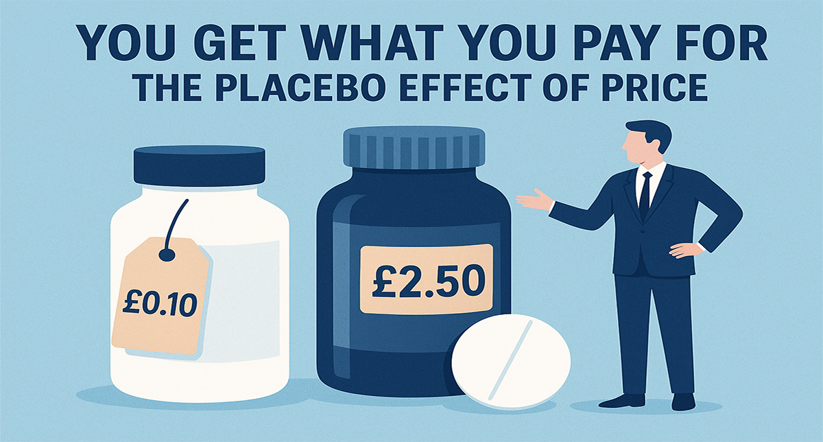
But when marketers want a product to feel special, like a handmade cheese or premium fragrance, a little difficulty is desirable. Complex fonts hint at uniqueness by slowing us down just enough to sense rarity.
📍 Consumer takeaway: The harder it is to read, the more “gourmet” it may feel, when used sparingly.
Slanted vs Upright: Speed vs Stability
A forward slant suggests motion and technological speed, the font is leaning into the future.
Whereas upright fonts stand firm, conveying tradition and reliability.
📍 Consumer takeaway: Sports brands lean forward. Insurance companies tend to stand up straight.
Lowercase vs Uppercase: Friendly vs Fearless
Lowercase lettering, especially when thin, can give off warmth, compassion and a modern creative vibe.
Uppercase is the opposite: strong, loud and heroic. It declares its presence.
📍 Consumer takeaway: If a brand wants to care for us, it softens its voice. If it wants to energise us, it shouts.
Connected vs Separated Letters: Together or Apart?
Letters touching each other suggest unity, community, and collective effort.
Spacing them distinctly conveys individuality and fragmentation.
📍 Consumer takeaway: A fitness studio might separate letters to emphasise personal progress; a charity might connect them to reflect togetherness.
Condensed vs Extended: Tight vs Relaxed
Condensed fonts signal efficiency and precision, excellent for anything slim, compact, or engineered with care.
Wider type gives a sense of comfort and spaciousness, like stretching out on a plush sofa.
📍 Consumer takeaway: Perfect shorthand for “engineered and exact” vs “lifestyle and leisure.”
Tall vs Short: Weight vs Luxury
Short fonts feel solid and grounded, heavy, stable, dependable.
Tall fonts float upward, associating with elegance, aspiration and luxury pricing.
📍 Consumer takeaway: Products that want to seem premium? Give them height.
It’s Not About the Font, It’s About the Fit
There’s a common misconception that if a font evokes energy or beauty or trust, it will automatically transfer that emotion to the product. But that’s not quite true.
It only works if the font’s meaning fits the context consumers already have in mind.
For example:
- A bold, military-style font on a gym poster? ✅ Makes perfect sense
- The same font for a baby food brand? ❌ Instant discomfort
When the brain detects a mismatch, processing becomes harder, fluency drops, and the consumer feels something is off.
Fluency creates joy. Incongruence creates doubt.
This is why certain typefaces, even historically negative ones, can work brilliantly when used in the right place. If the meaning matches the moment, even a controversial font can suddenly feel… appropriate.
Practical Retail & Shopper Marketing Takeaways
If fonts are talking, brands need to listen. Here’s what this research means for those shaping consumer experiences:
1️⃣ Match the font’s personality to the message
Slim product? Choose a condensed font.
Comfort-based brand? Rounded forms are key.
2️⃣ Think about where consumers encounter the font
Serifs shine in print. Sans serifs win on screens, especially small ones.
3️⃣ Use disfluency strategically for premium cues
A touch of typographic challenge can elevate perceived value.
4️⃣ Typography should evolve with brand story
As meanings shift with culture, font choices must stay aligned.
5️⃣ Test, don’t assume
Consumers aren’t always conscious of how type influences them, so asking isn’t enough. Observe behaviour.
The Subconscious Salesperson Hiding in Every Typeface
Typography isn’t decoration, it is persuasion. It’s a silent language that shapes first impressions before a single word is read.
From elegance to eco-friendliness, aggression to aspiration… whatever a brand wants shoppers to feel can be whispered by its letters long before the product speaks for itself.
As retailers fight for attention across shelves and screens, the smartest brands recognise that every glyph is a piece of psychology. The right font doesn’t just make a product look good, it makes it feel right.
And when something feels right, we buy.