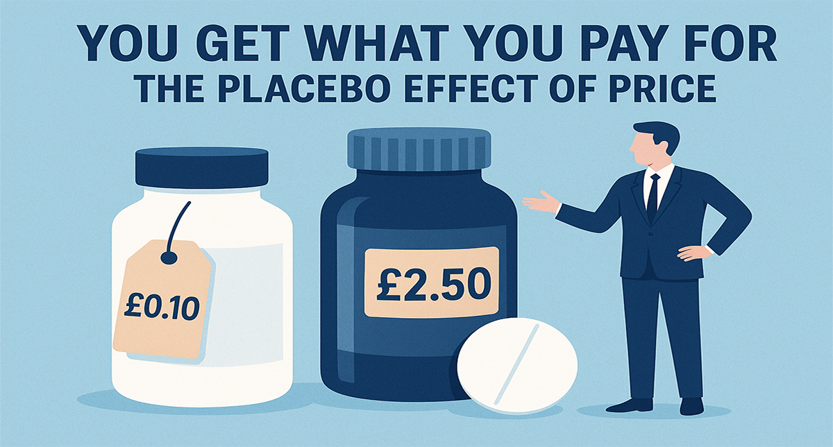
You might know you fancy a Shiraz, or that you’re steering clear of anything too pricey. But beyond that, how do you choose? If you’re like most of us, the label does a lot of the heavy lifting.
And according to new research, it’s not just about pretty pictures or bold fonts, your eyes, quite literally, give away how you decide.
A study with eye-opening results
A team of researchers set out to explore how wine labels capture our attention and, crucially, what that means for consumer choice. Using a combination of eye-tracking technology and choice experiments, they monitored where people looked, how long they looked for, and whether that attention translated into a decision to buy.
The results were striking: what we see, and how long we see it, has a powerful effect on what ends up in our shopping basket.
Why eye-tracking matters
Unlike surveys where people report what they think influenced them, eye-tracking captures unconscious behaviour. It’s not about what consumers say, it’s about what they do.
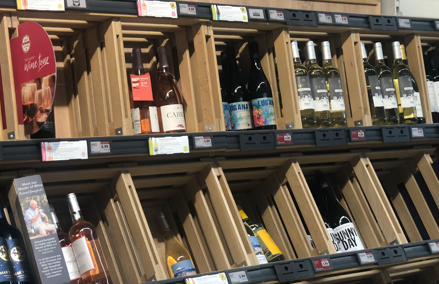
For example, when participants browsed mock wine shelves, certain features consistently grabbed their gaze:
- Brand names drew immediate attention, often acting as the first filter.
- Images and symbols on labels encouraged longer “dwell time”, which in turn increased the likelihood of a purchase.
- Price cues were noticed, but only after other design elements had already shaped perceptions.
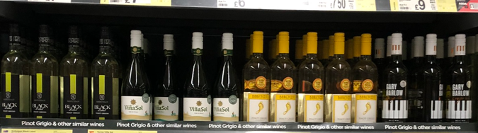
In short, labels aren’t just decorative, they guide the buying journey step by step.
The power of a sticky gaze
The study revealed something fascinating: when participants fixated on a particular bottle for longer, the chance of choosing that wine went up significantly. The researchers call this the attention–choice link.
Think of it this way: the longer your eyes linger on a label, the more your brain is nudged into liking it. It’s a subtle but powerful psychological effect, and one that marketers should not underestimate.
What this means for wine producers
For winemakers and marketers, the message is clear: investing in label design is not just about aesthetics, it’s about influencing consumer behaviour in measurable ways.
Here are some practical takeaways:
- Make the brand name stand out. Since it’s the first thing consumers notice, clarity and visibility are crucial.
- Use imagery wisely. Pictures, logos, or symbols can lengthen attention spans, nudging shoppers towards purchase.
- Balance tradition and novelty. While consumers are drawn to eye-catching designs, they also rely on familiar cues of quality and authenticity.
- Don’t hide the price—but don’t lead with it either. Price is important, but it often comes after design has done its work.
Why this matters beyond wine
While the study focused on wine, the findings ripple out into the wider world of consumer goods. From craft beer to speciality coffee, from olive oil to chocolate bars, the same rules apply: what the eye sees first can make or break a sale.
It’s also a timely reminder in an era where e-commerce is booming. Online, where consumers scroll through endless product images, the first impression of a label or pack shot can be even more decisive.
A balancing act: science and storytelling
Wine, of course, isn’t just another product, it’s steeped in heritage, romance, and ritual. Labels need to do more than simply grab attention; they need to tell a story that resonates. A quirky illustration might catch the eye, but a thoughtfully crafted logo or a reference to terroir might be what convinces a seasoned drinker to trust the bottle.
That’s where the artistry of design meets the science of consumer psychology.
What consumers can take away
If you’re a wine lover, this research might make you pause next time you’re browsing the shelves. Are you really choosing based on taste preferences and quality, or has your subconscious been swayed by a cleverly placed graphic or an elegant font?
Being aware of these subtle nudges doesn’t make you immune, of course, but it does add a fascinating layer to the way we think about shopping habits.
The future of label design
As technology continues to advance, we can expect more experimentation with design elements that optimise attention. Think interactive labels, QR codes, or even augmented reality features that turn a bottle into a mini storytelling experience.
But no matter how far innovation goes, the core insight remains the same: attention is currency. If your product doesn’t capture it, you risk being overlooked, literally.
Final sip
This research leaves us with a simple truth: the label on a bottle of wine isn’t just a wrapper. It’s a silent salesperson, shaping our choices with every glance.
For producers, the challenge is to harness that power authentically, drawing in the eye without misleading, sparking curiosity without overwhelming, and building a brand that not only sells a bottle but keeps customers coming back.
And for the rest of us? Next time you linger over a label, just remember: your eyes might have already made the decision before your head (or your palate) has caught up.