That’s not marketing folklore. It’s hard evidence from a fascinating piece of academic research that every designer, marketer and brand leader should know about. Professors Tatiana Fajardo, Jiao Zhang and Michael Tsiros dug deep into how logo frames, those tidy boxes, circles and borders that contain many brand marks, affect how consumers feel about a brand, especially when purchase risk comes into play.
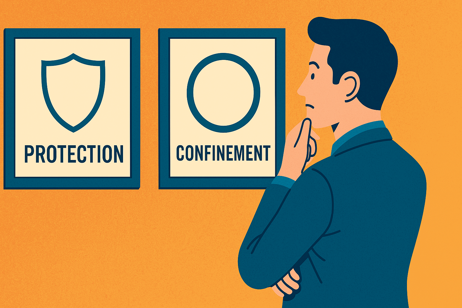
Their findings reveal a psychological see-saw between two competing symbolic meanings: protection and confinement. And depending on the situation, that logo border could be boosting or busting your sales.
Let’s unpack what they found, and what it means for anyone creating, managing or refreshing a brand identity today.
Why Frames Matter More Than You Think
A frame seems innocuous. It gives structure, balance and polish. Designers often add them for neatness or symmetry. Think of Coach’s elegant oval emblem, General Electric’s swirling badge, or Smucker’s red-ribbon border.
But Fajardo and colleagues asked a deeper question: what does a frame symbolise to the human mind?
Frames, after all, create boundaries. And boundaries can make us feel protected, safely enclosed from threats, or trapped, as if freedom has been fenced off.
The researchers proposed that consumers switch between these interpretations depending on context, particularly the level of risk they perceive in a purchase.
- When risk feels high (say, buying a new tech product, or choosing an unfamiliar brand), people seek safety and reassurance. → In that mindset, a framed logo subconsciously feels protective, like a shield, boosting trust and purchase intent.
- When risk feels low (think low-stakes everyday items), people value freedom and self-expression. → Here, the same frame can feel confining, overly rigid or corporate, subtly dampening the desire to buy.
In short: the same logo frame can either help or hinder, depending on consumer mindset.
Six Studies, One Big Realisation
Across six experiments involving hundreds of consumers, the research team tested how logo framing and perceived risk interacted in real purchase scenarios, from scented candles and MP3 players to cars and mobile apps.
Here’s what they discovered.
1. Risk flips the effect
When participants saw a framed logo on a high-risk product (for example, “no returns” purchases), their intent to buy went up. The frame felt like a comforting layer of safety.
But in low-risk conditions, the same frame made people less likely to buy. It gave off a sense of restriction, as if the brand were less open or flexible.
In other words: the frame effect reversed with the level of perceived risk.
2. The effect holds across product types
From £25 candles to £20,000 cars, the pattern persisted. Under higher risk, frames boosted purchase intent; under low risk, they reduced it.
That means this isn’t limited to luxury or impulse goods, it’s a broader consumer psychology pattern relevant to nearly any category.
3. Protection vs. Confinement drives the change
Further studies measured people’s subconscious perceptions. Under high risk, framed logos were rated as more protective; under low risk, as more confining.
Those feelings, in turn, directly predicted purchase intent. The researchers confirmed it through statistical mediation: it’s not the frame itself doing the work, it’s the meaning consumers attach to it.
4. Personality matters too
Not all consumers react equally. People high in openness, the curious, creative, variety-seeking types, are particularly sensitive to feelings of confinement.
When risk was low, these individuals were especially turned off by framed logos. They read the border as a barrier to self-expression.
Meanwhile, when risk was high, openness didn’t matter; everyone sought protection.
5. The effect sticks to brand identity
Interestingly, the frame’s symbolic power only worked when it surrounded core brand identifiers, especially the logo. When frames were placed around secondary elements, like a slogan or product description, the effect largely vanished.
The closer the frame sits to the heart of brand identity, the stronger its emotional pull.
6. But it can spread, if the message fits
In one experiment, when the slogan itself primed feelings of safety (“Fast. Convenient. Secure.”), a frame around it enhanced purchase intent, essentially amplifying that protective cue.
But when the slogan celebrated freedom (“Fast. Convenient. Liberating.”), the frame clashed and reduced intent.
The lesson: visual and verbal signals must align. A mismatched metaphor, “freedom” wrapped in a box, can backfire.
What It All Means for Marketers and Designers
1. Design isn’t decoration, it’s psychology
Every visual choice carries symbolic meaning. Frames aren’t just graphic features; they’re signals. They tell the brain something about boundaries, safety and control.
When you tweak a logo, you’re shaping subconscious cues that influence trust, emotion and intent.
2. Match your design to the purchase context
Consider when and how your product feels risky.
- Financial risk: expensive, long-term or irreversible purchases (cars, tech, luxury goods).
- Functional risk: uncertain performance (new products, start-ups, disruptive innovations).
- Social or identity risk: choices that signal status or taste (fashion, lifestyle brands).
In those moments, a framed logo can reassure. It quietly communicates structure, safety and credibility.
Conversely, for low-risk, hedonic or expressive products, snacks, beauty, entertainment, open logos may better convey freedom, creativity and fun.
Rule of thumb: the riskier the decision, the more a frame can help. The more expressive the decision, the more it can hurt.
3. Align visual and verbal cues
Consumers process design holistically. If your tagline celebrates liberation or individuality, but your logo sits in a tight box, the message jars.
Consistency matters: safety cues (frames, shields, solid shapes) should pair with safety messages (“trusted since 1901”), while freedom cues (open shapes, fluid typography) should pair with expressive or adventurous language.
4. Consider audience personality and mindset
Know your crowd. If you target creative professionals, early adopters or youthful trendsetters, groups high in openness, they’ll respond better to less constrained visuals.
If your audience is risk-averse or values reliability, parents, investors, or healthcare consumers, a framed, contained identity may instil comfort and credibility.
5. Use framing strategically, not stylistically
Logo frames are easy to add, which makes them easy to overuse. Resist the temptation to see them as mere “styling”. Instead, use them deliberately:
- Introduce a frame when launching into new or uncertain markets, it signals reassurance.
- Remove or relax the frame when repositioning towards innovation, playfulness or creativity.
- Consider seasonal or campaign-based framing (e.g., holiday borders) to temporarily cue safety or nostalgia.
From the Lab to the High Street
Let’s bring it to life with a few familiar examples.
- John Lewis: its classic logotype sits within a clean, contained format, understated, reliable, reassuring. Perfect for a brand built on trust and “never knowingly undersold”.
- Virgin: the red scrawl has no frame at all, it’s wild, energetic and rule-breaking, perfectly suited to a brand promising freedom and rebellion.
- Apple: famously unframed, yet its simplicity and spaciousness communicate confidence rather than chaos, reflecting low perceived risk due to brand equity.
- Hermès: its orange box is the brand, a literal frame synonymous with heritage, craft and protection.
Each brand’s design subtly mirrors the level of risk, reassurance or self-expression it wants to evoke.
Why This Research Matters Now
Today’s marketplace is defined by choice overload and uncertainty. New products, subscription models and digital brands constantly vie for attention.
Consumers crave both safety and freedom, sometimes in the same breath. The art of modern branding lies in knowing which to lean into, and when.
- A fintech start-up tackling consumer scepticism might adopt framed elements to build perceived security.
- A direct-to-consumer fashion label might ditch them entirely, embracing openness and authenticity.
- Even within one brand, product tiers can vary: a “Pro” line might be framed and formal; a “Lite” version open and playful.
Understanding the contingent nature of visual symbolism, the heart of Fajardo et al.’s paper, empowers marketers to design with intent, not instinct.
The Hidden ROI of Design Psychology
Marketers love metrics. But design’s influence often hides in the emotional shadows of decision-making.
This research bridges that gap. It shows that something as subtle as a border can measurably change purchase intent, sometimes reversing direction entirely.
That means design decisions carry real commercial weight. They can mitigate perceived risk and drive conversion, or, if mismatched, quietly erode trust.
Investing in consumer-tested design psychology could deliver as much ROI as any media spend.
Three Take-aways for Brand Teams
- Think beyond aesthetics. Every line, shape and boundary tells a story. Treat your logo as a behavioural cue, not just a badge.
- Design for context, not consistency. The best branding systems flex. A rigid frame everywhere might reassure investors but repel creatives. Adapt your visual language to audience and situation.
- Test, don’t guess. Consumers don’t articulate these feelings consciously, so qualitative feedback alone won’t reveal them. Use A/B testing, neuromarketing or behavioural experiments to measure how design tweaks shift trust and intent.
Framed Thinking for a Fluid World
The genius of this research lies in its simplicity. By studying a humble logo frame, Fajardo, Zhang and Tsiros remind us that context changes meaning.
A border can be a shield or a cage. The trick is knowing which your customers see.
So, next time you’re approving a rebrand or sketching a campaign logo, pause before you draw that box. Ask yourself:
“Am I protecting my brand, or boxing it in?”
Because in the consumer’s mind, the difference between safety and suffocation might be just a few millimetres of line.
Based on “The Contingent Nature of the Symbolic Associations of Visual Design Elements: The Case of Brand Logo Frames,” Journal of Consumer Research, Vol. 43 (2016), by Tatiana M. Fajardo, Jiao Zhang and Michael Tsiros.


