Here’s a tour through 23 science-backed tactics that help turn online browsers into confident buyers. They’re small, almost invisible tweaks, but together they can transform your customers’ experience and your bottom line.
1. Tight Layouts Feel Cheaper, Spacious Ones Feel Premium
Even in the digital world, customers still think like they’re in a physical shop. When product tiles sit close together, the page feels crowded, and that’s associated with lower prices and bargain finds. Give the same products generous white space and they suddenly look premium and aspirational.
So, choose your spacing deliberately: tighter grids for deals, wider layouts for luxury. And for extra effect, use precise prices (£18.47, £24.93) in those denser layouts, precision looks thrifty.
2. Reframe Why Shoppers Reach the End Without Buying
Reaching the end of a product list with nothing in the basket can trigger a subconscious thought: “I didn’t like anything.” Counter that by changing the story. Add a prompt such as “Can’t decide? Try our quiz” or “Need help choosing?” Now their inner monologue becomes, “I just need more help choosing.” That small reframing keeps them in buying mode.
3. Spark a “Which One” Mindset
When people make even a trivial choice, say between two colours or two animals, they automatically slip into a decision-making mindset. You can tap into that by asking small preference questions or offering visual filters early in the journey. It nudges customers past the “Should I buy?” stage and straight into “Which one should I buy?”.
4. Display for Browsing Horizontally, for Searching Vertically
Our eyes are built for horizontal scanning, which is why product carousels feel natural when we’re exploring. But when people know what they want, vertical lists work best: they make item names easy to skim. Use horizontal layouts for discovery (“New In”, “Trending Now”) and vertical lists for specific searches.
5. Keep Eyes on Your Site with a Dark Header
When a website background matches the light colour of browser tabs, the tabs blend in visually, making it easier for shoppers to click away. Adding a darker top border helps separate your site from those distractions and subtly keeps attention anchored where it belongs.
6. Give Feedback When Products Are Added to Basket
That tiny buzz or animation when someone adds an item to their basket isn’t just flair, it’s persuasion. On mobile, a short vibration mimics the sense of physical touch, reinforcing ownership. On desktop, a quick visual motion (a shake, a bounce, an item flying into the cart) does the same job. It feels good, and what feels good gets repeated.
7. Hint at People Without Showing Them
Photos with people can add warmth, but they often steal focus from the product or make it feel “owned” by someone else. A better approach? Imply human presence, a coffee cup left steaming, a pillow slightly indented, footprints by the pool. You get the emotional lift of humanity without the distraction.
8. Show Products Alone First, in Context Later
When customers are comparing, clean isolated images make decision-making easier. Once they’re on the product page, contextual photos, the sofa in a living room, the coat on a model, help them imagine ownership. So, start minimal in your catalogue and grow immersive as they move closer to checkout.
9. Tailor Imagery by Gender
Men and women often process images differently. Studies show women respond more positively to contextual scenes, clothing outdoors, furniture in a styled home, while men tend to prefer isolated, product-only shots. Use this knowledge to segment visuals in email campaigns or adverts for a subtle lift in relevance and conversion.
10. Help Shoppers “Feel” the Product
Touch is one of the most persuasive senses in physical shopping, and it can be simulated online. Use close-up shots of hands interacting with the product. Angle handles or buttons to the right-hand side (most people are right-handed). Show small, graspable objects nearby to make the main item feel tangible. These cues create a sense of physicality that increases perceived ownership.
11. Dial Down Colour for Distant Purchases
When people think about future events, they literally imagine them in greyer tones. That means grayscale or desaturated imagery works better for pre-orders, long-term memberships, or products with future delivery dates. Full, bright colour suits urgent or immediate purchases. Luxury brands use this instinctively, the “black-and-white equals prestige” effect.
12. Keep Collages Clean for Newcomers, Messy for Fans
New customers gravitate toward clean, ordered visuals, they’re forming first impressions. Returning customers, however, prefer a bit of creative chaos: overlapping images, lively textures, a “behind the scenes” vibe. Think of it as moving from showroom to lived-in space. Match your visual style to the customer’s familiarity with your brand.
13. Shape Signals: Round Feels Friendly, Angular Feels Smart
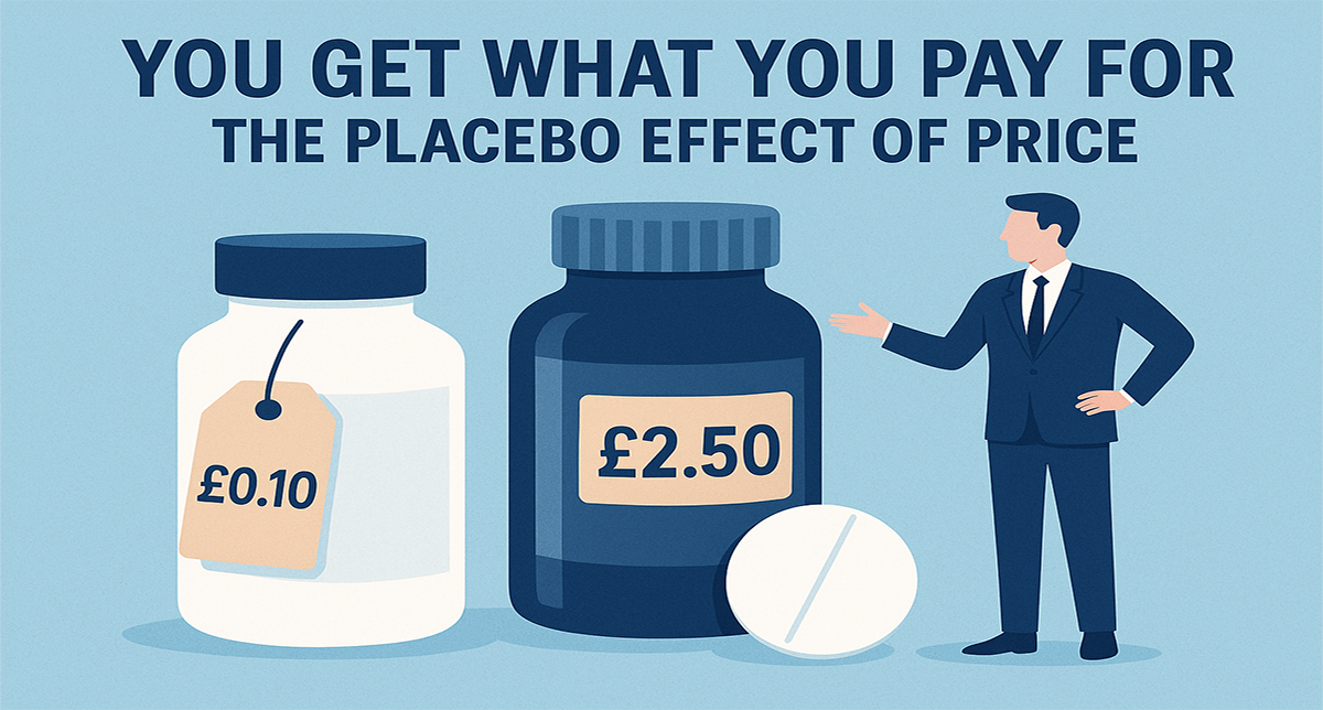
Objects carry personality. Round packaging feels warm and emotional, perfect for self-care, indulgence, or comfort. Tall, angular shapes convey precision and intellect, better for technical or problem-solving products. Even numbers echo this pattern: round prices (e.g. £40) feel soothing; sharp decimals (£39.57) feel rational and exacting.
14. Imperfection Can Sell
In marketplaces and service listings, both very attractive and very unattractive faces often outperform the average. Why? Because extreme traits are memorable, and people associate less attractive faces with competence and diligence. Don’t chase bland perfection, authentic, distinctive, or even slightly awkward imagery can come across as more trustworthy.
15. Put the Hero on the Left in Bundles
For audiences who read left to right, attention starts on the left-hand side. If you’re showing bundles or multi-item offers, put your most appealing or best-value product first. That initial impression shapes how the rest are judged.
16. Adjust Camera Angles for Emotion
Angles send powerful subconscious messages.
- Upward angles make products look powerful, luxurious, and authoritative.
- Downward angles make them seem approachable, lightweight, or sustainable.
Need your gadget to feel portable? Shoot from above. Want your handbag to look exclusive? Shoot from below.
17. Zoom In for Urgency, Out for Long-Term
We naturally associate closeness with immediacy. Zoomed-in images feel “now”; wide, distant shots feel “later”. So, use tight crops for flash sales, meal deliveries, and in-stock items. Use wide frames for pre-orders, events, or aspirational purchases. The visual distance should match the time distance.
18. Show What’s Inside
Layered or “exploded” product images, like a sneaker showing its sole, mid-layer, and lining, signal engineering and reliability. The trick is to leave a little space between each layer, so the viewer can mentally assemble them. It’s a small tweak that boosts perceived performance and value.
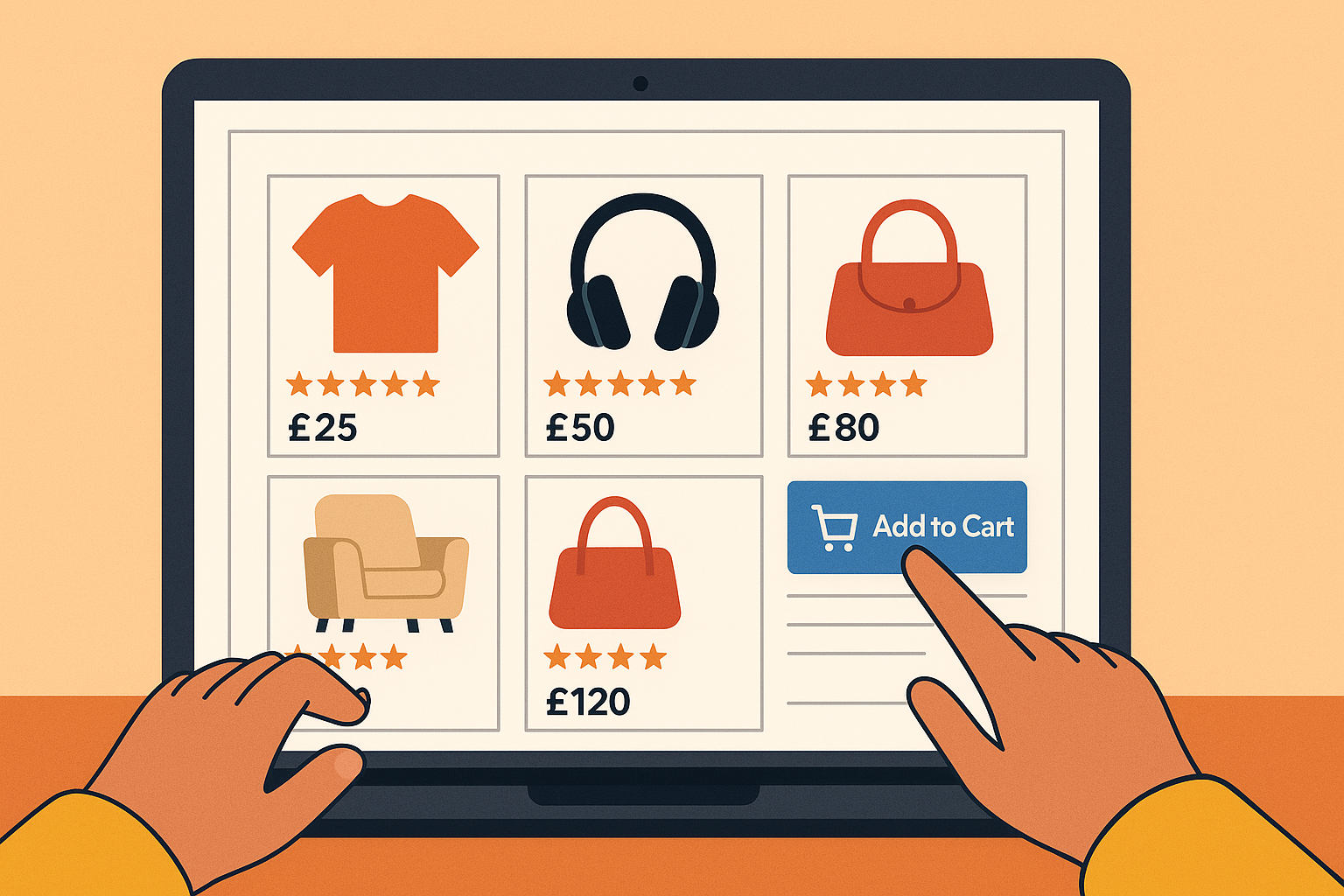
19. Make Ratings Visual
A 3.8/5 rating feels like “three-something”. But three and a half shining stars looks far more positive. Visual formats, stars, bars, progress rings, anchor perception higher than numbers do. Even better, continuous bars feel smoother and more complete than separate icons, subtly conveying momentum towards perfection.
20. Don’t Fear Mild Profanity in Reviews
A carefully placed swear word can make a review sound passionate and authentic. People instinctively trust emotional risk-takers more than sanitised, corporate voices. If your platform allows it, let the occasional “bloody brilliant” through, just ensure it’s genuine, not excessive. It signals real human enthusiasm.
21. Respond to Every Negative Review
Very few businesses bother, yet replying thoughtfully to criticism consistently improves ratings and conversions. It shows accountability, reassures future customers, and can even encourage more reviews overall. A calm, constructive reply turns potential damage into proof of care.
22. Add Trust Signals to Reviews
Certain details make reviews instantly more persuasive:
- Real names instead of usernames.
- Verified purchase badges.
- Photos or videos from the buyer.
- Clean writing free from spelling mistakes. These cues tell readers, “This person is real, and their experience matters.”
Encourage rich, multi-dimensional feedback, ratings for quality, design, and price, not just an overall score.
23. Show a Few Flaws
Perfect scores can actually reduce trust. Most shoppers feel more confident when ratings hover around 4.3 or 4.4 stars, or when reviews mention small drawbacks (“Runs slightly large”, “Takes a few days to break in”). The minor blemish makes the praise believable, and that authenticity drives conversions.
The Thread That Connects Them All
Across these 23 tactics runs a simple truth: what feels right sells better. Shoppers are constantly making subconscious judgements based on familiarity, association, and sensory cues.
They don’t think “this image is desaturated, therefore the event feels distant”. They just feel it. They don’t analyse why a downward camera angle makes something seem easier to use, they simply experience it that way.
The magic happens when your digital environment quietly matches what the brain expects.
Turning Psychology into Practical Action
You don’t need to overhaul your entire site to benefit from these findings. Small, low-cost tweaks can produce meaningful shifts in perception and performance.
Try starting with one from each category:
- Layout: Reduce whitespace on your sale pages.
- Imagery: Add a subtle downward angle to products that should feel approachable.
- Reviews: Replace numerical ratings with stars and respond to every critique.
Then measure the results. E-commerce optimisation isn’t about grand redesigns, it’s about dozens of tiny improvements working in harmony.
Why It Matters Now
Online shopping has become a sea of sameness: identical grids, identical copy, identical checkout flows. As AI-driven personalisation and algorithmic ads level the playing field, the next competitive advantage lies in understanding how people truly think and feel when they shop.
Psychological design is the new frontier of retail success. It’s not manipulative, it’s empathetic. It’s about building experiences that align with human nature rather than fight it.
The Takeaway
The future of e-commerce belongs to the brands that combine creativity with cognitive science. Whether you’re designing a storefront, an email, or an advert, every pixel and phrase can whisper something to the subconscious: trust this, want this, buy this.
And when your digital environment speaks the same language as your customer’s mind, conversion becomes less of a challenge, and more of a natural conclusion.