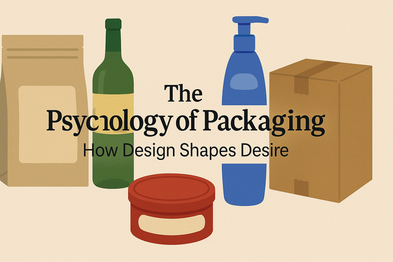
Each bottle, box, or bag is more than a container; it’s a message. Packaging doesn’t just protect what’s inside, it sells it. And when you start to understand the psychology behind packaging design, you realise just how powerfully it can steer what we buy, how much we consume, and even how we feel about a product.
This isn’t about fancy branding or trendy design. It’s about subtle cues, size, shape, colour, material, and placement, that quietly influence our perceptions and emotions. Let’s unpack how each of these elements works, and what it really takes to design packaging that connects with customers.
1. Size Matters: Why Smaller Can Feel Smarter
It turns out that size changes everything, not just how a product looks on the shelf, but how we perceive its quality and intensity.
Smaller packaging feels more concentrated and intense. Take coffee, for instance: served in a small, narrow cup, it’s often perceived as stronger and more bitter. That same coffee in a larger cup might feel milder, even if the brew is identical. There’s something about a compact space that makes the contents feel more potent.
This isn’t just about beverages. When snacks come in smaller containers, like crisps in a narrow tin or energy drinks in slim cans, they’re often judged to be of higher quality. Consumers instinctively link smaller, self-contained packaging with premium products, especially when it looks like a complete portion. That’s part of why single-serve products, from yoghurt pots to laundry pods, have become so successful. They make you feel like you’re getting a full, satisfying experience, not just a scoop from a giant tub.
But be careful with tall packaging. While a tall bottle can make a product seem larger and more substantial, it also makes customers buy less of it. Beer in bottles, for instance, tends to be bought in smaller quantities than beer in cans, simply because those tall bottles look more “enough” on their own.
In short: small packages can feel intense and premium; tall packages feel bigger but can reduce volume sold. The right choice depends on whether you’re selling indulgence or abundance.
2. The Texture Test: What Materials Say About You
Touch is powerful, even when we’re not actually touching the product. The material and finish of packaging shape how we feel about what’s inside long before we take it home.
Glossy vs Matte
A glossy surface might look attractive under shop lights, but in the world of food, it’s a risky move. Shiny packaging often makes people think of oil and grease. That’s fine for indulgent treats, but it’s a problem if you’re selling something healthy. Matte finishes, by contrast, come across as natural, simple, and clean. Think of plain brown paper on organic snacks, it signals authenticity and wholesomeness.
Glass vs Plastic
Then there’s the power of glass. Glass packaging, with its satisfying weight and clarity, instantly elevates a product. It conveys craftsmanship and taste. A jar of sauce or a bottle of juice just feels more premium in glass, partly because it’s heavier, and that weight subconsciously translates to substance and quality.
Smooth vs Rough
Texture also speaks gender. Rough surfaces feel rugged, masculine, and bold, while smooth, delicate finishes lean feminine and refined. That’s why a spicy aftershave might come in a coarse, matte box, while a floral perfume is wrapped in sleek, glossy paper.
No Packaging at All?
And here’s a twist: sometimes no packaging at all can be the best packaging. When you display products bare, think fresh fruit or handmade soap, it signals purity and freshness. Packaging can act as a barrier between a product and nature. Removing it, when appropriate, makes the item feel closer to its source and more authentic.
The lesson? The feel of your packaging, even when only seen, communicates your brand’s values as much as your logo does.
3. Shape Speaks Louder Than Words
Packaging shape is another quiet influencer. It affects how customers perceive a product’s weight, taste, and even its personality.
Wide = Heavy and Substantial
Wide packaging feels grounded and solid. It gives off a sense of heaviness and stability, perfect for products that want to feel rich and indulgent. A wide yoghurt pot feels creamy; a squat jar of peanut butter seems hearty and filling.
Tall = Healthy and Luxurious
Tall packages, on the other hand, subconsciously remind people of tall, slim bodies. That makes them ideal for health and beauty products that want to look lean or sophisticated. In luxury markets, tall and slender also signals exclusivity, just think of champagne bottles, perfume flacons, or high-end skincare tubes.
Round = Sweet and Feminine
Then there’s the power of curves. Round shapes feel soft, friendly, and sweet. They’re often seen as more feminine, hence the round boxes for chocolates or cosmetic creams. Angular packaging, by contrast, looks sharper and more masculine, and suits products that promise energy, spice, or strength.
Shape sets tone as much as any slogan could. The trick is to match your packaging silhouette to the story you want the product to tell.
4. Colour Codes: How Hues Shape Health and Indulgence
Colour is one of the fastest ways to signal emotion, and packaging colour has an enormous influence on what customers expect from a product.
Light = Healthy
Light, pale colours are associated with ease and lightness. They make a product feel healthy, low in calories, and even physically lighter to lift. White, beige, or soft pastels give the impression of purity and minimal processing, ideal for wellness brands, natural foods, or eco-friendly products.
Dark = Indulgent
Dark colours, on the other hand, feel heavier and more indulgent. A chocolate bar wrapped in deep brown or black packaging seems rich and satisfying, while the same bar in white or cream packaging might look like a “lighter” alternative.
Natural Tones = Authentic
Earthy hues, beige, sand, oatmeal, or muted browns, evoke authenticity and a connection to nature. These “au naturel” colours are perceived as non-artificial and wholesome. They outperform brighter, more artificial colours even when those bright shades seem more obvious. For example, people preferred beige packaging for carrots over orange packaging, even though carrots themselves are orange. Why? Because the beige felt more natural and genuine.
Bright = Synthetic
Overly bright, saturated packaging can backfire, making food seem processed or unhealthy. It screams for attention but doesn’t feel trustworthy. That’s why natural and organic brands have shifted towards muted, desaturated tones, they feel honest and calming.
In essence, if you want your product to seem healthy, fresh, or authentic, go light and natural. If you want it to feel indulgent, deep tones are your friend.
5. The Weight Illusion: How Placement Changes Perception
Where elements are placed on packaging, top, bottom, left, or right, can subtly influence how heavy or light a product feels.
When an image or logo sits at the bottom of a design, it makes the product feel weightier and more substantial. Similarly, placing visual elements on the right-hand side gives a sense of heaviness, because our brains imagine that side as “pulling down”. These placements are perfect for items meant to feel rich, hearty, or filling, like a dense loaf of bread or a protein bar.
Conversely, placing visuals or labels on the left makes a product feel lighter, healthier, and fresher. The brain reads left as “up” or “lifted”, which makes this layout ideal for salads, juices, and low-fat foods.
Even the simplest layout decisions, left vs right, top vs bottom, can shift how consumers experience your product before they’ve even picked it up.
6. The Power of Realism: Show, Don’t Tell
For emotional, sensory products, foods, drinks, fragrances, cosmetics, realistic imagery sells the experience better than abstract graphics. When people see a vivid, realistic photo of a gooey dessert, it’s almost like they can taste it. Real images help customers imagine the pleasure of using the product.
That’s why transparent windows in food packaging work so well. Being able to see the product directly, rather than a printed image, increases perceived freshness and quality. It creates trust: customers know exactly what they’re getting. This transparency also heightens desire, because seeing real food triggers stronger cravings.
But there’s a flip side. If your product appeals to people who don’t enjoy the process of using it, say, a fitness programme or a cleaning product, it’s better to show the outcome rather than the action. Instead of people sweating through a workout, show them smiling after it’s done. The emotional focus should always be on the result your customer wants, not the effort it takes to get there.
7. Keep It Whole: Why Completeness Feels Bigger
Finally, the shape of the packaging itself, and whether it feels “complete”, has a surprisingly strong effect on how big it seems.
When a package has missing sections or cut-outs, people instinctively perceive it as smaller and less valuable, even when the actual volume is the same. In experiments, consumers preferred fully circular sandwiches over semicircular ones, simply because the complete shape felt more satisfying. The same principle applies to bottles and boxes: if there’s a gap or hollow handle, the product looks like it contains less.
If you need a handle, consider an attached one rather than a hollow space, it maintains the full silhouette and preserves the sense of volume. The eye wants wholeness; anything incomplete feels reduced.
Designing for Perception, Not Just Protection
When you add up all these psychological effects, it’s clear that packaging design is about much more than aesthetics. It’s about managing perception. The way a package looks, feels, and sits on the shelf shapes everything from the emotions it evokes to the assumptions people make about what’s inside.
The Takeaway: Design for Feeling, Not Just Function
In an age when consumers make split-second decisions, packaging design isn’t decoration, it’s persuasion. Every contour, colour, and texture contributes to a story about what your product is and what it stands for. Done right, that story doesn’t just sell one product; it builds loyalty, desire, and emotional connection.
Great packaging isn’t about shouting the loudest on the shelf. It’s about whispering the right message into your customer’s mind, a message that says: this is the one you want.hat’s inside, it sells it. And when you start to understand the psychology behind packaging design, you realise just how powerfully it can steer what we buy, how much we consume, and even how we feel about a product.
This isn’t about fancy branding or trendy design. It’s about subtle cues, size, shape, colour, material, and placement, that quietly influence our perceptions and emotions. Let’s unpack how each of these elements works, and what it really takes to design packaging that connects with customers.
1. Size Matters: Why Smaller Can Feel Smarter
It turns out that size changes everything, not just how a product looks on the shelf, but how we perceive its quality and intensity.
Smaller packaging feels more concentrated and intense. Take coffee, for instance: served in a small, narrow cup, it’s often perceived as stronger and more bitter. That same coffee in a larger cup might feel milder, even if the brew is identical. There’s something about a compact space that makes the contents feel more potent.
This isn’t just about beverages. When snacks come in smaller containers, like crisps in a narrow tin or energy drinks in slim cans, they’re often judged to be of higher quality. Consumers instinctively link smaller, self-contained packaging with premium products, especially when it looks like a complete portion. That’s part of why single-serve products, from yoghurt pots to laundry pods, have become so successful. They make you feel like you’re getting a full, satisfying experience, not just a scoop from a giant tub.
But be careful with tall packaging. While a tall bottle can make a product seem larger and more substantial, it also makes customers buy less of it. Beer in bottles, for instance, tends to be bought in smaller quantities than beer in cans, simply because those tall bottles look more “enough” on their own.
In short: small packages can feel intense and premium; tall packages feel bigger but can reduce volume sold. The right choice depends on whether you’re selling indulgence or abundance.
2. The Texture Test: What Materials Say About You
Touch is powerful, even when we’re not actually touching the product. The material and finish of packaging shape how we feel about what’s inside long before we take it home.
Glossy vs Matte
A glossy surface might look attractive under shop lights, but in the world of food, it’s a risky move. Shiny packaging often makes people think of oil and grease. That’s fine for indulgent treats, but it’s a problem if you’re selling something healthy. Matte finishes, by contrast, come across as natural, simple, and clean. Think of plain brown paper on organic snacks, it signals authenticity and wholesomeness.
Glass vs Plastic
Then there’s the power of glass. Glass packaging, with its satisfying weight and clarity, instantly elevates a product. It conveys craftsmanship and taste. A jar of sauce or a bottle of juice just feels more premium in glass, partly because it’s heavier, and that weight subconsciously translates to substance and quality.
Smooth vs Rough
Texture also speaks gender. Rough surfaces feel rugged, masculine, and bold, while smooth, delicate finishes lean feminine and refined. That’s why a spicy aftershave might come in a coarse, matte box, while a floral perfume is wrapped in sleek, glossy paper.
No Packaging at All?
And here’s a twist: sometimes no packaging at all can be the best packaging. When you display products bare, think fresh fruit or handmade soap, it signals purity and freshness. Packaging can act as a barrier between a product and nature. Removing it, when appropriate, makes the item feel closer to its source and more authentic.
The lesson? The feel of your packaging, even when only seen, communicates your brand’s values as much as your logo does.
3. Shape Speaks Louder Than Words
Packaging shape is another quiet influencer. It affects how customers perceive a product’s weight, taste, and even its personality.
Wide = Heavy and Substantial
Wide packaging feels grounded and solid. It gives off a sense of heaviness and stability, perfect for products that want to feel rich and indulgent. A wide yoghurt pot feels creamy; a squat jar of peanut butter seems hearty and filling.
Tall = Healthy and Luxurious
Tall packages, on the other hand, subconsciously remind people of tall, slim bodies. That makes them ideal for health and beauty products that want to look lean or sophisticated. In luxury markets, tall and slender also signals exclusivity, just think of champagne bottles, perfume flacons, or high-end skincare tubes.
Round = Sweet and Feminine
Then there’s the power of curves. Round shapes feel soft, friendly, and sweet. They’re often seen as more feminine, hence the round boxes for chocolates or cosmetic creams. Angular packaging, by contrast, looks sharper and more masculine, and suits products that promise energy, spice, or strength.
Shape sets tone as much as any slogan could. The trick is to match your packaging silhouette to the story you want the product to tell.
4. Colour Codes: How Hues Shape Health and Indulgence
Colour is one of the fastest ways to signal emotion, and packaging colour has an enormous influence on what customers expect from a product.
Light = Healthy
Light, pale colours are associated with ease and lightness. They make a product feel healthy, low in calories, and even physically lighter to lift. White, beige, or soft pastels give the impression of purity and minimal processing, ideal for wellness brands, natural foods, or eco-friendly products.
Dark = Indulgent
Dark colours, on the other hand, feel heavier and more indulgent. A chocolate bar wrapped in deep brown or black packaging seems rich and satisfying, while the same bar in white or cream packaging might look like a “lighter” alternative.
Natural Tones = Authentic
Earthy hues, beige, sand, oatmeal, or muted browns, evoke authenticity and a connection to nature. These “au naturel” colours are perceived as non-artificial and wholesome. They outperform brighter, more artificial colours even when those bright shades seem more obvious. For example, people preferred beige packaging for carrots over orange packaging, even though carrots themselves are orange. Why? Because the beige felt more natural and genuine.
Bright = Synthetic
Overly bright, saturated packaging can backfire, making food seem processed or unhealthy. It screams for attention but doesn’t feel trustworthy. That’s why natural and organic brands have shifted towards muted, desaturated tones, they feel honest and calming.
In essence, if you want your product to seem healthy, fresh, or authentic, go light and natural. If you want it to feel indulgent, deep tones are your friend.
5. The Weight Illusion: How Placement Changes Perception
Where elements are placed on packaging, top, bottom, left, or right, can subtly influence how heavy or light a product feels.
When an image or logo sits at the bottom of a design, it makes the product feel weightier and more substantial. Similarly, placing visual elements on the right-hand side gives a sense of heaviness, because our brains imagine that side as “pulling down”. These placements are perfect for items meant to feel rich, hearty, or filling, like a dense loaf of bread or a protein bar.
Conversely, placing visuals or labels on the left makes a product feel lighter, healthier, and fresher. The brain reads left as “up” or “lifted”, which makes this layout ideal for salads, juices, and low-fat foods.
Even the simplest layout decisions, left vs right, top vs bottom, can shift how consumers experience your product before they’ve even picked it up.
6. The Power of Realism: Show, Don’t Tell
For emotional, sensory products, foods, drinks, fragrances, cosmetics, realistic imagery sells the experience better than abstract graphics. When people see a vivid, realistic photo of a gooey dessert, it’s almost like they can taste it. Real images help customers imagine the pleasure of using the product.
That’s why transparent windows in food packaging work so well. Being able to see the product directly, rather than a printed image, increases perceived freshness and quality. It creates trust: customers know exactly what they’re getting. This transparency also heightens desire, because seeing real food triggers stronger cravings.
But there’s a flip side. If your product appeals to people who don’t enjoy the process of using it, say, a fitness programme or a cleaning product, it’s better to show the outcome rather than the action. Instead of people sweating through a workout, show them smiling after it’s done. The emotional focus should always be on the result your customer wants, not the effort it takes to get there.
7. Keep It Whole: Why Completeness Feels Bigger
Finally, the shape of the packaging itself, and whether it feels “complete”, has a surprisingly strong effect on how big it seems.
When a package has missing sections or cut-outs, people instinctively perceive it as smaller and less valuable, even when the actual volume is the same. In experiments, consumers preferred fully circular sandwiches over semicircular ones, simply because the complete shape felt more satisfying. The same principle applies to bottles and boxes: if there’s a gap or hollow handle, the product looks like it contains less.
If you need a handle, consider an attached one rather than a hollow space, it maintains the full silhouette and preserves the sense of volume. The eye wants wholeness; anything incomplete feels reduced.
Designing for Perception, Not Just Protection
When you add up all these psychological effects, it’s clear that packaging design is about much more than aesthetics. It’s about managing perception. The way a package looks, feels, and sits on the shelf shapes everything from the emotions it evokes to the assumptions people make about what’s inside.
The Takeaway: Design for Feeling, Not Just Function
In an age when consumers make split-second decisions, packaging design isn’t decoration, it’s persuasion. Every contour, colour, and texture contributes to a story about what your product is and what it stands for. Done right, that story doesn’t just sell one product; it builds loyalty, desire, and emotional connection.
Great packaging isn’t about shouting the loudest on the shelf. It’s about whispering the right message into your customer’s mind, a message that says: this is the one you want.